Part II of my sewing room project....what to do with that empty wall?
Honestly, I knew exactly what I wanted to do with it.
My inspiration came from, where else, Pinterest.
Have you seen this on Pinterest?

An adorable use of fabric and an embroider hoop.
A much cheaper, homier feel than expensive framed wall art.
Not to mention it is completely personalize-able.
Next, my main inspiration came from this fun digital poster.
You can find it over at Compulsive Craftiness.
Her hubby designed it for her sewing room,
and she gladly shared it with the blogging world so you could do the same.

While this poster is so much fun, I just wasn't feeling the chevron.
I know, I know, it is so 'in' right now, but I've never been one to swim with the tide.
So I decided to blend the elements from these two inspirations and make my own version.
First step, I went to my local thrift shop in search of embroider hoops.
There were none in the craft section to my dismay, but when I wandered through
the home decor section, I saw these sad, outdated pieces.
They were 25 cents each, you can't beat that!
I just stripped off the fabric pictures and lace...easy.
After searching the web, I found a sewing machine image that suited my fancy.
I printed it out, then traced it onto a clear plastic folder sleeve.
Then I used our projector to illuminate the outline onto my piece of fabric.
I laid my fabric on top of the sleeve so the image shone through, then traced over it.
I traced the design backwards so that when I flipped it over, the marked up side wasn't showing.
Then I cut my machine out.
Setting that aside, I went to cut out the fabric for my hoop.
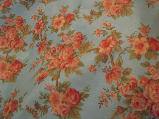
Isn't this print just gorgeous?!
We found it at our local, old style dry goods store.
They have a beautiful, albeit, little spendy collection of fabrics.
We splurged and bought a yard of this print.
I followed the same method of tracing and cutting out the circle of fabric
as used when I cut out the paper for my tins.
After searching through all our computer fonts and coming up less than satisfied,
I decided to trace the font used on the poster.
That scrolling 'and' was key to the flow of the design, so there was no way around it.
I accomplished this by blowing up the poster image, and actually tracing the text onto my clear sleeve by holding it up to the computer screen.
Unconventional, yes. But, hey, it worked!
The poster text was actually solid, filled in letters.
I just traced the outlines and decided I liked the look.
I used my projector again to lightly trace these letters in pencil onto my fabric.
But I wasn't done yet...
Using brown craft paint, I traced over the pencil lines.
After sewing on the machine silhouette (I used a straight stitch on my sewing machine),
I was able to trace the 'and' over it and paint it as well.
I painted the 'and' in a shade of pink that complemented the fabric and would stand out against the solid brown sewing machine. Once the pink was dried, I outlined it in brown.
And this is how it turned out!
Don't look too close now, or you will notice that my letters are a bit crooked.
At first it really bothered me, but I liked the overall result so much, that I was pretty forgiving.
While I had the fabric out and the machine warm, I whipped up a matching pin cushion.
While I had the fabric out and the machine warm, I whipped up a matching pin cushion.
This adorable little tin was thrifted for 10 cents.
I secured the cushion into the tin with hot glue.
And there you have it!
Well on my way to getting my sewing space all set up.
Check in Thursday to see what else I made!


This is beautiful project :)
ReplyDeleteI love the linen, and you did pretty good job.
I love your blog full of crafting/sewing projects and I am following now.
Anyway, I have giveaway, if you are interested then come and visit :)
http://delvalinatuanger.blogspot.com/2013/07/graduation-giveaway.html
Have a great day.
Blessing,
Delvalina
Yay, a new friend! Nice to 'see' you here, Delvalina. Thank you for your nice comments. I'll be sure to stop by your blog, thank you for the invite!
Delete~Des~